Long-term clients of ours, Civil Aviation Authority of New Zealand (CAA), were in need of a brand refresh to consolidate a brand that had been used inconsistently across the board over decades. Our design team worked together to create new brand features as an extension of the old identity, that would enable CAA to reach its plans for continued growth.
We worked on
- Illustration
- Campaign
- Print design
- Storytelling

Process
The new brand features needed to support the existing logo and represent the bi-cultural ambitions of CAA. The brand had to feel modern, cohesive, and consistent across all touch points, but most of all the brand had to continue to engage the aviation community under the trusted and established brand of CAA.
We collaborated with Ben Thomason who brought his background in Te Ao Māori and Mātauranga Māori to the design, ensuring a strong cultural link to the contemporary designs we created.
The brand
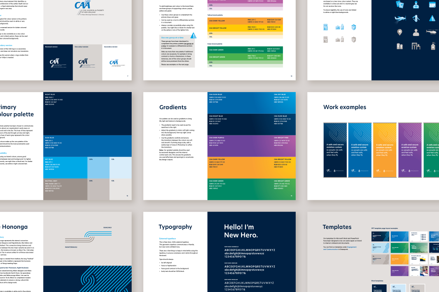
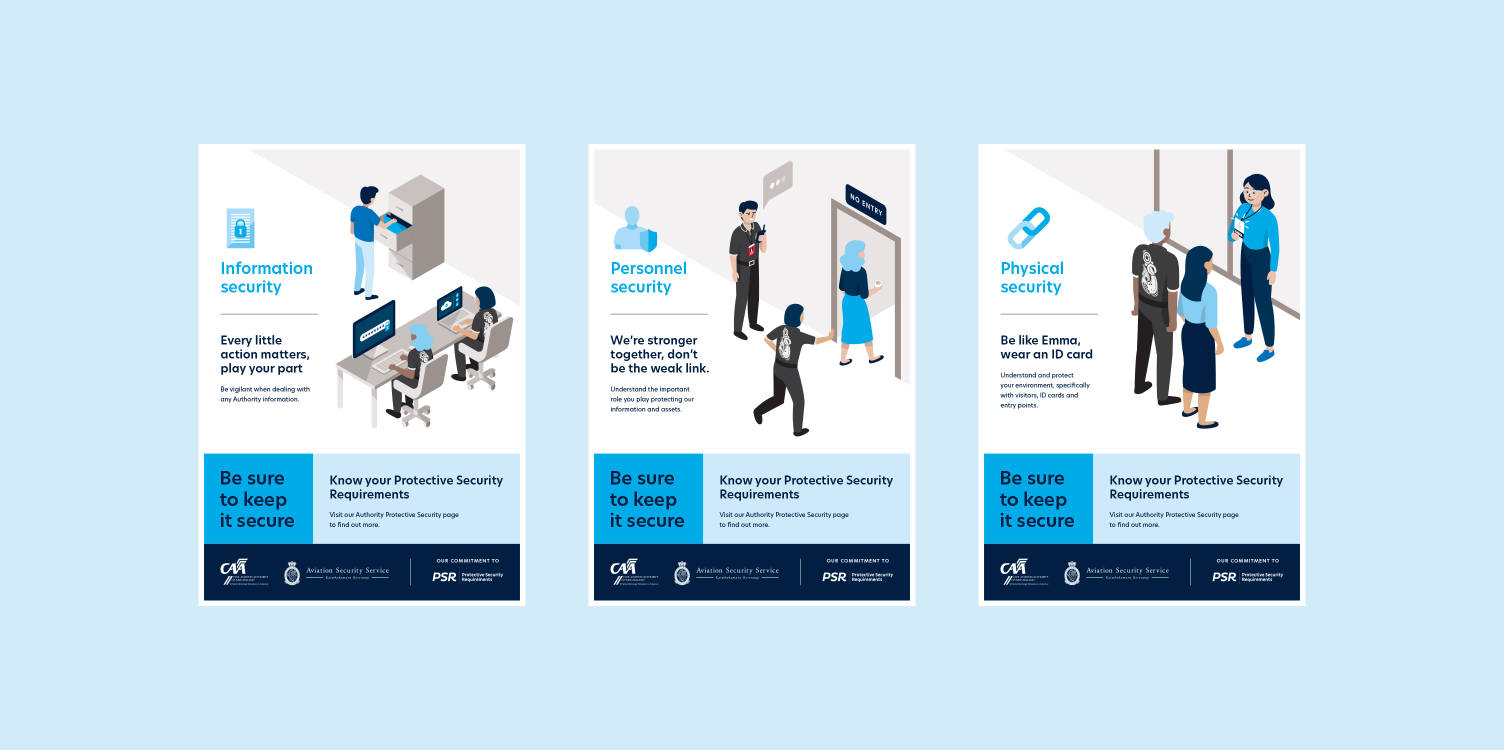
Our design audit of the brand saw that there was a need to bring more visual elements to the identity, liven up the colour palette and typography, and establish clear rules around imagery and writing to achieve the best public and internal facing design solutions.
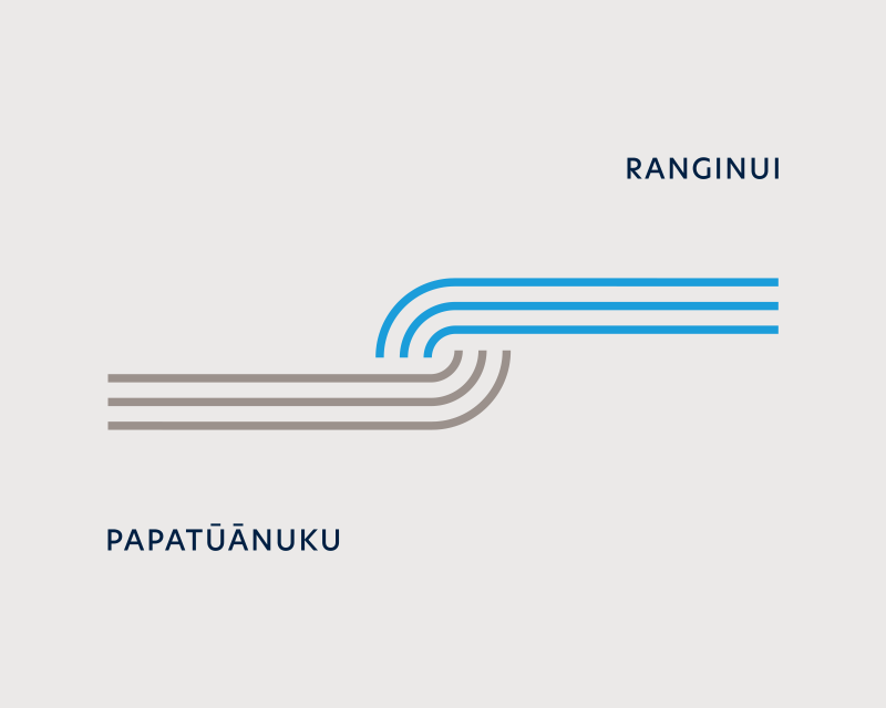
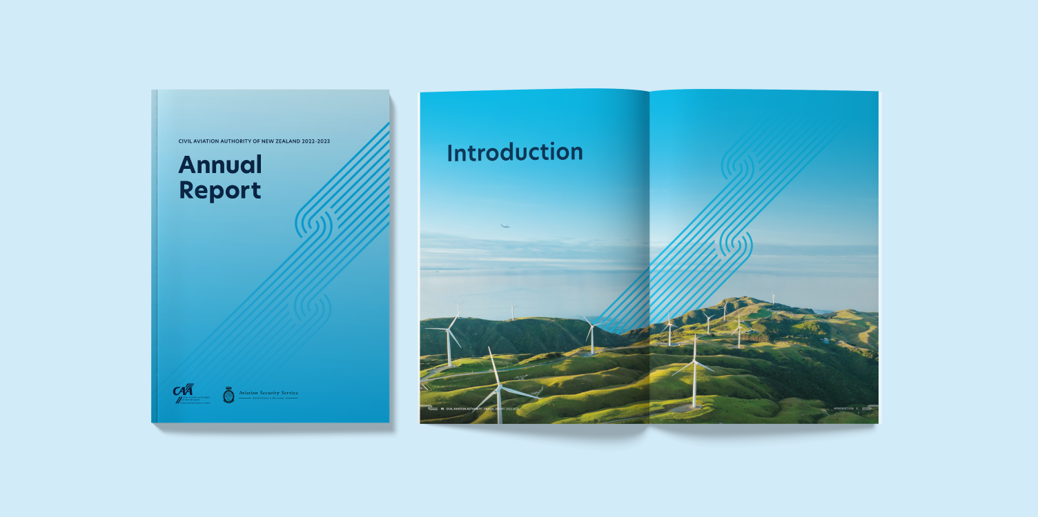
The spearhead of the brand update was introducing a pattern. Inspired by the story of Ranginui and Papatūānuku – the pattern we created, named Te Hononga, leans into a narrative about connection, bringing balance and harmony known as Mauri Tau. CAA relies on Mauri Tau to ensure safety for all those associated with its services. The design is created from haehae that meet in the middle to represent Rangi meeting Papa, aka the sky meeting the earth.
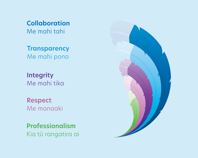
We based the Civil Aviation Authority's new values around Huia feathers.
Kei hea te Huia – te manu tapu i arohatia e Tane?
Literally, this means ‘Where is the Huia – the sacred bird revered by Tane, the god of the forest?’ The Huia and its feathers were highly prized. The feathers were recognised as a symbol of leadership and worn by female and male chiefs.
